Friday 29 August 2014

The Lupine Book Club Sunday Afternoon Reader


Despite the name of the blog, books don't get mentioned a lot on here. So I thought it was time to mix it up a little, and chuck this up on here, inspired by this article from The Surfing Pizza.

Sunday afternoon is not one of my favourite times of the week. It’s usually too late to start any major new undertakings, but too early to go to bed. The spectre of work looms over the forthcoming week, its ominous presence casting a gloomy shadow over the enjoyment you might otherwise get from simply not being at work.

The evening is usually better – church, dinner with friends or simply watching TV are all great ways to alleviate this. But these are all night-time activities, with the possible exception of TV – and free-to-air TV on a Sunday afternoon is usually a black pit of despair in and of itself. the hours between 1 and 5pm can be a grim time.
A lot of this probably stems from high school. Though I had many friends, I rarely hung out with them outside the confines of school. There was “nothing to do” at my place (though to be fair, you can extend that criticism to just about anywhere as a teenager), so I didn’t invite people around and I didn’t often take the initiative to go and hang out at a friend’s home instead. So more often than not, solace was found in the confines of the local library. Open from 1-4 on a Sunday afternoon, it served as a place for me to read books and comics – and perhaps most importantly, it helped stave off the Sunday afternoon blues.

So I’ve put together a list of books that I find great for Sunday reading. Some are old, some are new. All are specific to my peculiar set of interests, so your own mileage with them will probably vary. But most of these books are not particularly rare or expensive, and a bit of second-hand bookshop or eBay scouring should see you being able to track most of them down easily, should you be so inclined.
Most of these books are structured in a short, easy-to-read, article-style fashion. This is perfect for Sudnay afternoon reading, when you want to be distracted, but don't want to invest too much time into something. 

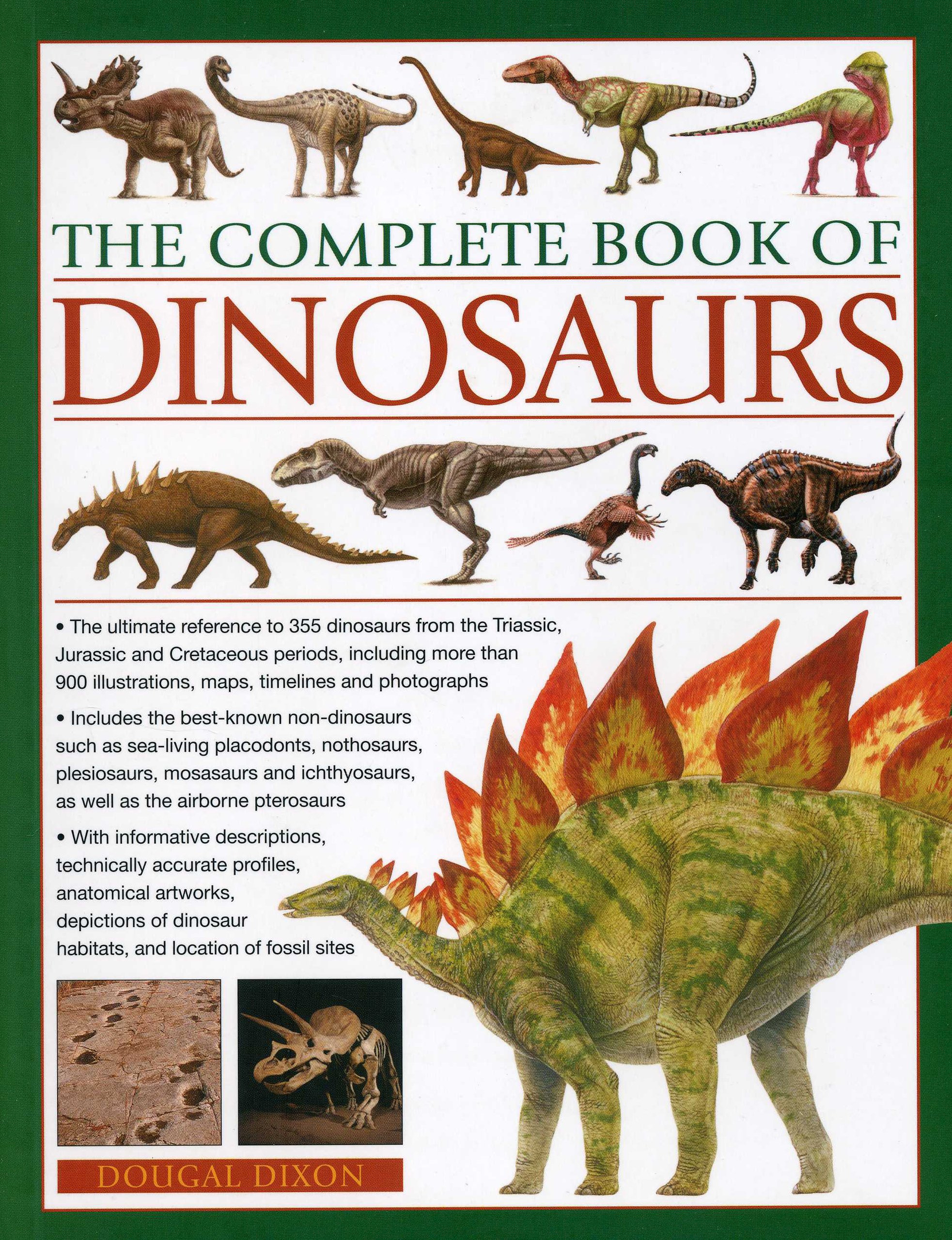
*The Complete Book of Dinosaurs (2006)
Picture from Amazon.com
Like many children, I was deeply obsessed by dinosaurs. I was going to be the first person to discover dinosaur soft tissue – or more specifically, dinosaur skin. It seemed like the logical progression – we had found bones, skin impressions and even evidence of feathers, but no actual soft tissue as far as I was aware. Soft tissue has since been found, and though I think skin is still up for grabs, my palaeontology days are probably behind me.
However, I have still retained my interest in dinosaurs into adulthod, and that's why I handed over the cash for this book. Divided up into short articles that covered all known dinosaurs (at the time of publication), it's full of great information and (almost equally importantly in such a book) loads of illustrations. If you have a favourite dinosaur, odds are strong you'll find something about it in here.  The $15 I paid for it was an absolute bargain.

 
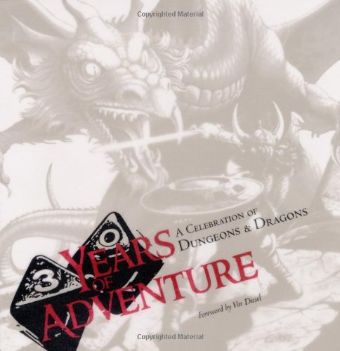
*30 Years of Adventure: A Celebration of Dungeons and Dragons (2004)


Picture from Amazon.com
I first played Dungeons and Dragons in 2006, when I was at one of my absolute lowest points of life. Desperately poor, attending uni and living out of home, it was the closest I ever came to Dickensian living. I don’t recommend it. So I do not exaggerate when I say that Dungeons and Dragons – among other pen-and-paper RPGs – was an absolute lifeline during this period.
Not long after I started playing, I came across this book in my local library. Not quite a straight history of the game, it’s more of a love letter to the franchise, as penned by various TSR and Wizards of the Coast employees, and numerous celebrities (including Vin Diesel and Stephen Colbert!)
Best of all, it’s packed with a huge amount of artwork that’s rarely seen now – I love TSR’s 1980s/early 1990s fantasy artwork. Lots of it is quite crude by today’s standards, but it has a charm and atmosphere that more modern iterations are hard-pressed to compete with -- in my opinion anyway.

Being published in 2004, the book finishes around the time of the 3.5 release. 4th and 5th edition were still years away, so it’s time for an update. I’d definitely pick it up an updated version if Wizards of the Coast decide to do one.   
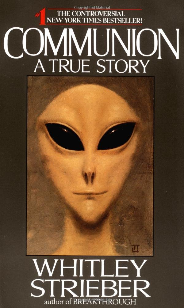
*Communion – Whitley Strieber (1987)
Picture from Amazon.com
Selling a huge number of copies in the late 1980s, Communion is a seminal work in UFO literature and probably best known to the general public today as the book that popularised the image of the “Grey”.
My parents were always fine with me reading books about UFOs, aliens, the paranormal etc as a kid, but they were a little bit funny about Communion and consequently I didn’t read it until I was probably in my mid-teens. But I do remember the cover image frightening me as a child; in hindsight it was probably the first time I had really seen an image of a grey – they were an uncommon sight in a pre-X-Files world. Ted Seth Jacob’s rendering gave it an almost photorealistic appearance, which made it seem much more real and therefore all the more disturbing. I’d seen alien illustrations before, but they were just that – illustrations, easily dismissed as unreal or non-threatening. This was different.   

The content within the book is almost as disturbing as its cover – though pretty standard stuff to those familiar with UFO and abduction literature, Strieber’s background as a horror author lends it a more unsettling tone than most. Incidentally, there's also a film adaptation starring Christopher Walken as Strieber -- apparently it's not great, though I've never seen it myself.

*Mysteries of the Unknown: Alien Encounters (1992)

Picture from Amazon.com
An absolute plethora of books on UFOs, aliens and the broader “unexplained” were published from the 1970s to the 1990s – just go check out your local second hand bookstore if you don’t believe me. Time-Life’s Mysteries of the Unknown series was one of the most prominent in the genre, spanning a whopping 33 volumes from the late 1980s through to the mid 1990s.
I only read maybe 4 or 5 of these – that was all that my library had, and most of them didn’t interest me – but they have remained as something of a personal gold standard for books on the unexplained. Classy, black faux-leather covers, lavish illustrations (many printed with metallic ink) and filled with interesting (if highly questionable) tales, it’s not hard to see why they were such a hit on release or why they're still so entertaining today.  Look at that ominous cover -- it's worth the price of admission alone!  

Though I’m sure I read this title as a kid, I recently ordered a 2004 reprint from eBay and found most of it quite unfamiliar. Perhaps it’s been longer than I remember between reads, or maybe I just never read it at all (SCREEN MEMORY ALERT). But it’s pretty much what you’d expect – alien abductions, the evolving nature of the phenomenon over the 20th century, comparisons with folk tales of fairies – and of course, ancient astronauts, with a heavy emphasis on the theories of Zecharia Sitchin. Though I haven’t seen any references to reptilians in there, which would be almost unthinkable were an updated version published today.  
I also spent a lot of time with its companion volume, The UFO Phenomenon, which I’ll hopefully cover in the next part of this series.  

BONUS MATERIAL: You can watch one of the ads for the Mysteries of the Unknown series here – and Julianne Moore showed up in another.

Well, that's it for part one. Hope you enjoyed it! Part two hopefully to come soon.


Wednesday 27 August 2014

Sensation Comics featuring Wonder Woman -- issues #1 & #2

THE BACKGROUND


Image copyright DC Comics 2014
Just over 70 years ago, Wonder Woman debuted in Sensation Comics, a creation of  William Moulton Marston, inventor of the lie detector and all-round eccentric. Mr Marston had many odd ideas that went into her creation (I won’t go into them here, but any good book on the history of comics will help you out – 741.5 under the Dewey Decimal System, down at your local library), but one that was actually quite good was the idea of a powerful female superhero, to serve as a role model for girls and boys alike. That’s a borderline radical concept now; think about how it went over in 1942!
Nonetheless, the character was given a shot and rapidly took off. She’s been in publication more or less continuously since then, though there have been some definite ups and downs along the way.

This latest publication, Sensation Comics, is a weekly digital comic, which will also be released in physical form later, much like the Arkham City or Injustice comics that have been doing the rounds for a while now. It appears to be outside of mainstream New 52 continuity, presumably to make it accessible to more casual readers and present “What If”- style stories.  Possibly the “featuring Wonder Woman” tagline may also mean that we’ll see other characters pop up from time to time too.

THE BOOK
This story arc that spans the first two issues, “Gothamazon”, is penned by Gail Simone, who worked on WW’s main title for a number of years in the pre New 52 relaunch.

The setup is simple enough – Batman’s rogue’s gallery decides to co-operate for a change, and the Dark Knight is subsequently taken out. Within hours Gotham City is falling to pieces, overrun by criminals. Thinking quickly, Oracle summons Wonder Woman to bring her brand of Amazon justice to the streets. Wonder Woman has never really been one for killing, but she’s nonetheless a trained warrior and immediately goes around kicking some criminal butt.
Of course, it’s not quite that simple – Wonder Woman is not Batman, and while she has strengths he doesn’t, she also has weaknesses he doesn’t. Very quickly she realises that ridding Gotham of its criminal element is not going to be the easy job she thought it would be.      

It’s a pretty cool concept and it gets off to a promising start. But it’s not explored as thoroughly as it could be, and although I enjoyed elements of the story and the ending, I think it was ultimately treated in a bit of a throwaway fashion. It’s a plot arc that could have worked in mainstream continuity either in the past or the future, but I think it needs to be extended over a longer period – maybe 5 or so issues to take a better look at the whole situation? 
Of course, a comic can’t really be reviewed separately from its art. Though I quite enjoy Ethan Van Sciver’s art, I don’t think he was actually the right person for this book. All of the supporting characters look quite good, but Wonder Woman herself looks a bit mixed – it’s like the detail of Brian Bolland combined with the more aggro look of John Byrne, and I don’t think these two looks work well in tandem. Sometimes it looks okay, but a lot of the time it just looks a little off. Still, everything else looks good – if she was just showing up as a supporting character we’d let it slide. Hopefully, though, if van Sciver continues on the book, his depiction will improve. 

OVERALL
All in all, these first two issues are a fun distraction, but not great. They both feel kind of rushed, and everything wraps up a little too neatly. Still, the title has promise, and for only US99c (Digital Edition) an issue I’m pretty happy to stick with the title for a while – I’m looking forward to reading more.  

Sunday 24 August 2014

Funko POP! RoboCop

Company: Funko
Year: 2013
Series: Movies

BACKGROUND
Well, Funko Week comes to a close with RoboCop. I’ve spoken previously about my deep love of RoboCop, and what an amazing film it is. Really, if you’re a regular reader of this blog it probably doesn’t need a whole lot of introduction. So let’s just say that if you haven’t seen it yet, you should definitely do yourself a favour and go check it out ASAP. The second one, not so much. And I’ve not watched the entirety of the third one…but I certainly wasn’t sold on it based on what I’ve seen of it. Which is about 15 minutes.

This particular POP! was presumably released on the back of the hype around the 2014 remake, which was predictably okay, but not spectacular film. Funko doesn’t seem to have done a “new” RoboCop to match, but perhaps they only had the license for the original film.

THE POP
RoboCop’s condition is actually pretty horrible if you think too much about it. The original film is pretty vague about what’s left of his human body, but you get the strong impression there’s not much more than his face and part of his brain. And when he takes off that mask, it’s pretty horrifying. I’ve watched a huge amount of horror films, but one image that has stuck with me more than just about anything from those days is RoboCop’s unmasked face 

Of course, the Funko POP! version doesn’t really convey the horror of his existence so well – he’s just a cutesy cyborg, rendered in the distinctive POP! style. And I must say, it’s turned out pretty well. All of the main details are intact and present – his chestpiece, the screws on the side of his head and his separate big toe. Held in his left hand is his signature Auto-9, the ridiculously powerful handgun that deals out justice on numerous occasions during the film.   
Now for the paint. Oh Funko…you do so many fun sculpts and then do such an average job on paint!

RoboCop is painted primarily in silver, to match his appearance in the first movie – as opposed to the blue-tinged armour he’d later get. In theory, this shouldn’t be a problem, considering that they did a great job on the Silver Surfer, but in practice it’s little thicker and goopier than it should be.

This is forgivable – but the main thing that bugs me here is that RoboCop’s skin-tone paint is not properly aligned with where it should be on his face. It might be fixable, but it shouldn’t really have to be. Funko isn’t at the same level as Kidrobot when it comes to making this stuff, and to be fair I don’t think they’re trying to be, but it can be extremely frustrating nonetheless. So if you pick one of your own up, check it out closely.    
 

OVERALL
Like many of my Funko POP! figures, the paint is disappointing but the figure is overall great fun. As a big fan of RoboCop, I’m very pleased to have him as part of the collection. Though it seems unlikely, it would be great to see Funko produce figures of Clarence Boddicker, this guy and a variant based on this figure.  Now that would be a line to see!

Friday 22 August 2014

POP! Heroes – Martian Manhunter


Company: Funko

Series: Heroes
Year: 2011

RRP: $15.95

THE BACKGROUND
First appearing in “The Manhunter from Mars” in Detective Comics, all the way back in 1955, Martian Manhunter has gone on to become one of the better-known B-listers of the DC Universe. He was a founding member of the Justice League of America, and has gone on to be a member of most of its various incarnations. He pretty much has all of Superman’s powers, but can also shapeshift, turn intangible and has telepathy/telekinesis. The only real downside is that he’s vulnerable to fire -- but then again, pretty much any normal person is too. I'd say it's an okay trade off.

Though it changes from time to time, Martian Manhunter generally works by day as a policeman or PI, calling himself "John Jones", the earth equivalent of his Martian name, "J'onn J'onnz" (yes, it's silly, but it was the 1950s). Naturally, his superpowers give him quite the edge in tracking down criminals.

Martian Manhunter has never quite broken through to true mainstream popularity, he’s still got a cult following, and it’s always a pleasure to see him turn up in a title. Hopefully if/when the Justice League movie eventuates, we’ll see him appear in a prominent role.

THE POP
Martian Manhunter uses the basic POP! body, though it’s been slightly retooled to accommodate his chest harness and belts. Similarly, the forehead on his head has been retooled to approximate his distinctive brow, though it’s not quite as prominent as it is in the comics.

The picture on the back of his box depicts him in his 1950-1990s style – namely, just cape, trunks and boots. However, the actual POP! has depicted him in a more contemporary style, with full pants. This a look I tend to prefer myself – the old-school strongman/pro-wrestling look is not one that I’m a huge fan of, though I appreciate that it’s a product of its time.  Still, it’s a slightly odd choice, as it’s not really an iconic look for the character.
Martian Manhunter is actually the best-painted POP! I own. Most of him seems to be cast in blue, with his arms and chest painted in his distinctive bright green. There’s a bit of gold slop on the harness, but nothing to get too worked up about. This is even more impressive when you consider that this was originally released back in 2011, and Funko were not doing particularly great paint work at the time.  


OVERALL
In my collection, Martian Manhunter fulfils much the same role that he does in the comics. He’s not the most prominent member, and he probably doesn’t get as much attention as she should, but he’s good to have around nonetheless. Highly recommended to Martian Manhunter and JLA fans alike. I just hope that in the future we'll eventually get a more Martian-looking version, and a John Jones.

POP! Heroes – Wonder Woman


Company: Funko
Series: Heroes
Year: 2011
THE BACKGROUND

And so we come to the first female POP! of Funko Week – Wonder Woman.
Wonder Woman is one of my favourite superheroes. One of the first females to join what is still a very heavily male-dominated crowd, she’s been in the game for more than 70 years now, appearing in her own title and serving as one of the early members of the Justice Society and a founding member of the Justice League of America.
Yet despite having some good runs (e.g. Lynda Carter in the 70s TV show, George Perez in the 1980s comics) she’s often been poorly handled by creators who aren’t quite sure what to do with her. One case in point was her 2006 relaunch, which regularly had issues delayed, a revolving door of writers and artists and dull stories that tested the brand loyalty of the fans (myself included). The only consistently good thing was the covers.   

Still, the New 52 seems to be writing some of these wrongs and the upcoming Superman vs Batman: Dawn of Justice looks to be featuring her prominently, with Gal Gadot in the role. Hopefully the future holds good things for her – but now, onto the POP!

THE POP
Wonder Woman wears her best-known outfit of red bustier, blue trunks and red boots, complete with tiara and bullet-deflecting gauntlets. It's a classic look, that could fit just about any era between the 1960s and now, though at a guess it's based on the standard Jose Luis Garcia-Lopes or George Perez depiction of her.

She uses the basic female body, which is okay, but I don’t think it looks quite feminine enough. I commented earlier this week that a lot of the early POP!s used the same basic body – and the female one kind of looks like it’s just been retooled from the male body, with minor variation. The arms are fine, but the legs seem a little off.
In her right hand, she clutches her signature weapon, the Lasso of Truth. While she whips out a sword from time to time, the Lasso is easily her best-known accessory and it would have been remiss of Funko not to include it in some form. If they ever decide to do a variant, she should have her throwable tiara off and held in her other hand.

Wonder Woman was one of Funko’s earlier POP!s, so her paint is on the questionable side. I picked her up last year at Supanova, and while I looked for a good one in among the pile they had, I don’t recall seeing any that were better. The tiara is sloppy, the earrings  have bleed and there's just lots of rough edges around the whole thing. It's disappointing, but pretty typical of the older POP!s – they're not at A-grade level these days, but they have definitely improved.


AVAILABILITY
This same sculpt of Wonder Woman has since been re-released in her New 52 outfit, which is similar but different. The reds and blues are darker, the yellow areas are now rendered in silver, and she’s got fewer stars on her trunks. I like what I’ve read of her characterisation in the New 52 (namely, a few issues of Justice League), but I don’t love the changes to the outfit. While it looks okay on the page, it doesn’t translate well to POP! form; the colours are too muted on what is an inherently brightly coloured and cutesy toy. Both versions are reasonably easy to track down though, so you should be free to take your pick.

OVERALL
While I’m happy with the broad strokes of the figures, the paint issues made her ultimately disappointing. I’d like to see this figure get a re-release with better paint, but in the meantime she’s still an essential part of the Funko Justice League – and most of her compatriots are in a similar (paint) boat.  

What’s more disappointing is that there have been very few females released as part of the Funko Heroes or Marvel lines. Raven and Starfire from the Teen Titans cartoon have both been released, as have Harley Quinn and a couple of variations of Catwoman. Marvel has had Jean Grey, Black Widow and Gamora, but that’s been about it.
Both Marvel and DC have a lot of cool female characters that would be likely to sell, so it’s disappointing that they’re being overlooked in favour of numerous re-releases of Batman, Spider-Man, Iron Man and Captain America. Even Hulk has had two or three figures by now!  These are all cool characters and I understand that they are big drawcards for more casual fans of the lines, but it’s time to go deeper.

Thursday 21 August 2014

POP! Marvel – SILVER SURFER

Company: Funko

Series: Marvel
Year: 2013

RRP: $15.95AUD

THE BACKGROUND
Jack Kirby was a creative guy, and without his efforts the world of comics – and by extension, pop culture – would be substantially poorer. My favourite creation of his is the Silver Surfer. Originally appearing in the pages of Fantastic Four (who are probably my least favourite Jack Kirby creations), the Silver Surfer was originally the herald of Galactus, a cosmic entity who roams the (Marvel) universe in search of planets to devour. Also, before he became the Silver Surfer his name was Norrin Radd. Sounds weird? It is. But hey, it was the 1960s.   

THE POP
When this guy was released, he was one of the first Comic POP!s I’d seen that deviated from the “standard” POP body that was so commonplace – a lot of the early DC guys are essentially just repaints of the same base body, with new heads subbed in, and many of the Marvel guys weren’t miles away from it either.   

I think the results were a little mixed. If they had gone with the same body as Superman and just painted it silver, it probably would have looked a little too plain. But they’ve gone with a Michael Turner-style ultra-buff body, complete with buttocks. It works well in the comics, but looks a little too detailed in comparison to the other POPs. Though I’m not really a fan of his 1960s “trunks” look, I think it might have been the right approach on this occasion. Kudos to Funko for trying to mix it up a little though.
 
 
Still, taken purely on his own merits, Silver Surfer is definitely a success. His surfboard is included, attached permanently to his feet, to complement his surfing pose. They’ve even etched grooves into the surface, rather than leaving it blank, which would surely have been the easier option.    

Norrin Radd is entirely silver, so in theory it should be pretty easy to get it right. Yet the figure still had a couple of problems -- on removing him from the packet, some of the silver paint on his head tore a little, as it seemed to have stuck to the plastic tray. Not a lot you can do there, really.
However, aside from these minor flaws, he’s fine. The paint is nice and even, and the tears on his head aren’t super noticeable.

OVERALL
The Silver Surfer is a great addition to the collection. I’ve only bought a handful of Marvel POPs (though some of the Guardians of the Galaxy are tempting me) and I tend to have high expectations of them as I’ll only pick up characters I care about a lot. Paint tearing aside, the Surfer turned out very, very well and has been one of my most satisfying purchases.   

I don’t much care about getting a set of the Avengers in POP! form, but I would like to get some of the Infinity Gauntlet gang. Presumably Funko will bring out a Galactus sooner or later (and they already have in their Marvel blind-boxes), and hopefully also a Thanos, Adam Warlock, Dr Strange…the list goes on! Then the Surfer will be able to share the shelf with some worthy Marvel companions.    


Wednesday 20 August 2014

POP! Movies – V

Company: Funko
Year: 2012/2013?
Series: POP! Movies
RRP: $15.95AUD

THE BACKGROUND
Released in early 2006, V for Vendetta made a huge impression on me. It may sound silly to some, but though I was historically and intellectually aware that some people treated others poorly on the basis of skin colour/sexuality/religious belief/political opinions etc, I hadn’t really had anything connect with me on a heart level that made it “real”. Being a white male, I’ve experienced very little discrimination in my own life, which probably accounts for this blind spot.

Watching it again some years on, I can appreciate that there are some valid criticisms of the film to be made. But watching V for Vendetta sparked a new awareness in me, something I hope I never forget – namely, discrimination against others is wrong and that we must always stand against totalitarianism. Simple sentiments to be sure, but ones that I think are well worth remembering.
(NB: I know the movie was based on a comic, but this guy was released as part of the Movies series rather than the Comics series)

THE POP  
The sculpt captures the character quite well, without moving outside of the Funko look. The most important part is, of course, the Guy Fawkes mask. It’s a stylised version of the film’s depiction, whose variations fit the Funko aesthetic nicely without deviating too far from the “real” look.

The body follows the same basic shape as most of the DC characters, though it’s been retooled for the details to match V’s outfit, and to feature a knife in each hand. The outfit looks a little under-detailed, but it still conveys the general impression of his costume. It's not exactly eyecatching, but its simplicity does mean that your eye isn't drawn away from the  intentional focal point of his mask. The cape is just the same as Superman and Martian Manhunter’s, though it’s cast in black. It’s inflexible, so don’t expect to pull off any windswept poses.   
V is quite a bit heavier than most other POP!s I’ve come across – largely because of his large Guy Fawkes, pilgrim-style hat, which seems to be solid, rather than hollow. It’s a separate piece to head itself, though it’s not removable. The hat is a big part of V’s look, but he does spend a considerable amount of time without it – it might have been good to see another version of him sans hat and cape.      

As for paint? Well, V is one of the better painted POP!s that I own, though I suspect this is because he is largely unpainted. Aside from his mask and head, only his belt buckle and knives are painted.
The details of the mask – the eyebrows, eyes, moustache and goatee – are all cleanly painted for the most part, though the left eye is slightly off. The cheeks also have a slightly rosy tinge. However, the bone-ish colour of the mask is rather dirty, as though a black wash has been put over it. This could be intentional – towards the end of the movie, V’s mask certainly does get very dinged up – but I’m not sure. Additionally, the unmasked underside of his head has been painted in a pale pink colour, a normal (if pale) skin colour – no sign of horrific burn marks here.   

The silver on his knives and belt buckle is quite sloppy, though it’s only really noticeable on close inspection, as it blends into the surrounding black.  

AVAILABILITY
V was in very short supply for a while there, and some retailers still seem to be charging an extortionate price for him online. However, over the last couple of months, he’s again been showing up in retailers and online again for RRP– maybe he’s been re-released? I’m not clear on how Funko structures its releases (e.g. whether certain runs are limited) and some cursory Googling hasn’t really resolved the matter. But suffice to say you shouldn’t be too hard-pressed to track him down.

OVERALL
V for Vendetta was one of my favourite movies for quite a while, so my expectations for this POP! were quite high, even more so after I had to spend quite some time tracking him down. I eventually came across him on Free Comic Book Day earlier this year. Did he live up to expectations? Yes, I think so, very minor paint issues aside. Though one must wonder if the manufacture of V for Vendetta merchandise is really keeping in the spirit of Alan Moore and David Lloyd’s creation, it’s nice to have him around the home nonetheless. The main disappointment is that there’s no Evey to accompany him – but perhaps in time.


Tuesday 19 August 2014

POP! Games -- Kratos

Company: Funko
Year: 2014
Series: POP! Games

BACKGROUND

The first God of War game burst onto the PS2, introducing its antihero Kratos to gamers all over the world. It had loads of violence, an entertaining story that drew from Greek mythology, a hero we could root for (even if he was a jerk), a bit of (black) humour and perhaps most amazingly of all, quick time events that were fun to play!

It’s no wonder it became such a hit, and sequels followed at a reasonable pace with God of War II in 2007 and God of War III in 2010. A number of spin-off games have also been released, and it seems that the series will return at some point on the PS4 – though one might assume it will be in somewhat different form than the original trilogy. If you’ve played the third game, you’ll know what I mean.    
There’s been a little bit of God of War merchandise over the years, but not as much as you might expect for such a large franchise. So it was with great pleasure that I discovered Funko had picked up the license for its POP! series.

THE POP
This Kratos is presumably based on his appearance at the beginning of God of War III – he’s got the scar running down his stomach, a scar over his right eye and a few other trappings, such as his signature kilt. In each hand, he holds one of the Blades of Chaos, his signature weapon. It would be nice to see some future versions of the character with his other weapons, like those lion gauntlets he steals from Hercules, but only time will tell.

The main criticism I could offer on initial glance is that he’s maybe a little too cutesy. This may sound silly when you consider that we’re talking about vinyl toys, which tend to have an inherently cute aesthetic, but the most of the “edgier” characters that turn up in POP! form tend to retain some of that edge. The horror movie characters Funko has done are great examples, as are characters like the Alien and the Predator.  Even when Kratos was turned into a Sackboy all the way back in 2008, he still looked pretty cranky. Maybe they should have gone for a different paint app on the eyes or eyebrows to create a similar effect. Nonetheless, the sculpt hits all the right notes, and is another great example of why I like the Funko style so much.
Something you’re probably going to hear me complain about a lot during Funko POP! week is paint. Funko’s paint jobs are slowly improving, but they’re still far from great, particularly when multiple paint apps are involved as with this figure. Kratos has continued this trend, being slightly above acceptable but certainly below ideal. His signature tattoo is cleanly tampoed, but there’s slop on the scar over his right eye, his goatee isn’t quite painted to the edges, there’s slop on his hands, and his feet are a bit messy.  

Still, when viewed as a whole, the effect is still impressive. Kratos has arrived on the POP! scene, and he’s ready to kick some vinyl butt.
 

OVERALL
This is a great representation of Kratos, except for his paint. And even that’s not so bad – so if you can get one which good paint, I can wholeheartedly recommend him as a great addition to the POP! family. Hopefully if this one sells well, we’ll see a few other variations of him released – and maybe even some of the other characters from the game added to the line.  

Monday 18 August 2014

POP! Television – Dr Tobias Fünke


Company: Funko

Series: Arrested Development
Year: 2014

RRP: $AUD 15.95

THE BACKGROUND
So, here's the first instalment of Funko POP! week kicking off with Dr Tobias Funke!

Arrested Development first began airing in late 2003. Smart, clever, funny and fast-paced, it never quite got the ratings it deserved, though it garnered many excellent reviews. In 2006, it would be cancelled – yet another show gone well before its time.

This was disappointing, but it was pretty much guaranteed that it would be a cult classic. And that’s exactly what happened. Whenever the deplorable state of modern TV is brought up, you can be sure someone will jump in and complain that Arrested Development got cancelled – it tends to be a race between the Arrested Development fan and the Firefly fan as to who gets in first.
I’ve been that guy on more than one occasion. And so we come to today’s review – my personal favourite character from the show, Dr Tobias Fünke, as portrayed by comedian David Cross.
THE POP

Tobias is dressed (or not dressed) in his signature outfit of denim cutoffs. He’s also wearing his glasses, and flip-flops. The likeness is good – it retains the Funko simplicity while still capturing the essence of the character well.

The paint is pretty good, especially as POPS go – they’re notorious for having crappy paint jobs. There’s still a bit of slop, and some damage on the back of his head where he’s been in the box, but Funko are definitely improving in this area. He also has some hair tampoed on his chest. Not quite as much hair as the real David Cross, but probably more appropriate for the Funko aesthetic (link possibly NSFW). 
 
 
The glasses are a separate piece, glued on at the sides of his head and held in via a hole in between his eyes. Additionally, the body isn’t one whole piece – it’s glued together at the waist.

On that topic, it seems that POP! vinyl figures used to be originally built on a handful of very similar base bodies – check out the Superman and Wonder Woman POPs (both originally from 2010, I believe), and you’ll see that while there are differences, it’s entirely possible that one mould was simply a retool of the other.

But now, there’s a lot more variety. Tobias is definitely indicative of this – he uses the classic headshape, yet his body looks to be completely new. Most of the characters in the line look to have unique bodies too, which is particularly impressive in this day of reused moulds and repaints. It’s good that Funko have been willing to invest so heavily in the line! 
AVAILABILITY

This Tobias should be readily available, and there’s apparently a variant version done entirely in blue. I’m not sure how rare/expensive this one will be, but I’ll definitely be picking it up if I come across it at the right price!

OVERALL
The Arrested Development series features 8 POPs, plus the 1 variant mentioned above. So there’s two Michaels, two Busters, a GOB, George-Michael and George Senior. I hope to get all of them. There’s plenty of characters that I’d like to see in future series as well – Lucille, Lucille 2, Maeby, Lindsay, Barry Zuckerkorn, Kitty, Stan Sitwell and Oscar, just to name a few. And there are still quite a few versions of existing characters that we could see – Hot Cop GOB, for instance!

I’m thrilled with this purchase, and hope we see many more in the future. Arrested Development was a fantastic show, and I’m still hanging out for the movie…hopefully it won’t be too much longer!
Also, it's nice to have another doctor in the collection, to go with the Assassin's Creed Plague Doctor ;)
    

Friday 15 August 2014

April O'Neil (TMNT 2012)


Company: Playmates
Year: 2012
RRP: (See “Availability”)

BACKGROUND

April seems to be far and away the rarest of the TMNT figures out there. She currently resells online for a ridiculous price. She seemed to be pretty readily available when I first bought the four turtles just over a year ago – but while every other character from that first wave still seems readily available, April is nowhere to be found on shelves.  
Why is she so rare?

Well, the smart money is on the “girls don’t sell in a boy’s toyline” theory, and she’s just been produced in smaller numbers than the other characters. In turn, this makes her substantially harder to find. A lot of boys do go through a phase where they shy away from “girl’s things”, but I would strongly debate that “I hate Barbie” does not necessarily equal “I hate April O’Neil.” But here we move into deeper waters, territory that demands an article of its own. Onto the review!
SCULPT AND ARTICULATION

April’s sculpt seems to follow the animation model reasonably closely but this does mean that her proportions end up looking a little odd. Her legs are disproportionately large compared to the rest of her, and her head looks particularly small. Fine on film, not great when rendered in plastic. Given that the turtle toys look little to nothing like they do in the show (at least until the Battle Shell ones came out), I think it would have been fine to go off-model a little.  
Articulation is not great.

*ball-jointed neck
*swivel-hinged shoulders
*cut forearms

*swivel hinged thighs
I think the lack of elbows and knees is particularly disappointing. This alone will be a reason not to buy for many of you reading – and I don’t have much to say to try and dissuade you from that.  

ACCESSORIES

The one really great thing about April is her accessories. She comes with a particularly long bo staff – longer than Donnie’s – as well as a rack of weapons which includes the following:
*2 shuriken
*a bokken (wooden practice sword)
*a shinai (bamboo practice sword)
*a tonfa                                                                                                                                                                     
*2 round objects which I assume are some kind of smoke grenades.
I’ve seen one reviewer speculate that April’s weapons rack was actually meant to come with Splinter, and this is quite possible this is the case. It’s possibly telling that the picture of her on the back of the box depicts her sans accessories.   


PAINT

April doesn’t have a huge amount of paint, but she does have a lot more than most of the characters in the line. Most of it is pretty cleanly executed, though she somehow ended up with some black slop on the back of her head.  

Based on the box art, there’s one app that’s missing on the actual figure – her mouth. The finished toy just leaves it as the sculpted line. This is a minor detail, but I think it’s significant. April is quite cute and endearing on the show, but this lack of painted smile leaves her looking a little odd. I may end up fixing it myself, with an artline pen or something.  

AVAILABILITY
In theory, April should only set you back around $AUD15. But she’s difficult to find in-store, and you’re likely to pay a considerable premium for her if you get her from a third-party reseller. I don’t recommend this, for reasons which I’ll go into in the next section. Buying stuff just because “it’s rare” is often not a wise move when you’re interested in something purely for play value, rather than resale value, and this is a classic example.

It should be noted that I found her in a Hawaiian Wal-Mart while on holiday a few months ago, and have not seen her again since. So if you are still keen, and you’ve got the opportunity to buy her for a reasonable price, take it.

OVERALL
Though I’m pleased to have gotten April for the collection, she’s not actually that great a toy on her own merits. I like the figure and can overlook her shortcomings on the basis of wanting her to complete a set, but taken purely on her own merits she is an easy pass. Hopefully, now that Casey Jones has been released we will soon see a new version of April on the market, with improved articulation. I don’t know that one is on the way, but I would advise waiting anyway. She’s an integral part of the franchise and it’s a shame she hasn’t received better treatment in plastic form.